Turning Clicks Into Quests

Northwestern PATH, a learning management system for the university’s engineering students to foster study skills, goal-setting, and mental well-being.
They sought a modernized system to boost engagement and retention with their students that they could eventually license to other institutions.
Client
Northwestern University
Year
2023
Team Structure & My Responsibilities
Project Manager
UX Lead (That’d be me!)
Design Lead
Interaction Designer
-

Discovery (4 weeks)
Desk Research | Stakeholder & User Interviewers | Survey Design | Problem Definition
-

Ideation (2 Weeks)
Wireframing | Gamification Strategy | Push Notification Strategy
-
Design Partnership (6 weeks)
Design Alignment | Empathy & Advocacy | Implementation Guidance
DISCOVERY
Let’s Get Familiar
With limited discovery time, I opted to conduct a virtual one-hour focus group (rather than individual interviews) with the program’s deans and software developers to:
Quickly increase our team’s subject matter knowledge
Learn about key features and usage patterns
Socialize our problem state to drive early stakeholder buy-in


We Learned
Post-pandemic student cohorts seemed to be less connected and more siloed
Many students rushed through course modules right before class
Stakeholders were curious about students’ perceptions of the program’s pacing and the module sequencing
Stakeholders wanted the content & system’s tools to inspire students to be more reflective on how they optimize their attention
What Were Others Doing?
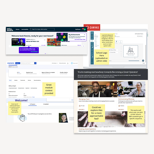
Our project team needed to understand industry standards to make smart strategic decisions, so I spent an afternoon taking notes on the competition.
Design Conventions
How similar products look and behave (UI, icons, content, layout)
-
Clear, personalized “My Courses” or “To-Do” sections, progress indicators, and announcements front & center.
-
Main navigation menus are section-based and persistent on the left, leaving more horizontal space for content.
-
Modules tend to be sequential & typically contain projected time to complete, discussion forums, and ratings.
Product Conventions
What similar products do (features, flows, offerings)

-
These systems allow learners to construct their own knowledge & understanding through active participation & interaction with the content, instructor, and their peers.
-
Reminders prompt users to return back and achieve their desired goals.
-
Similar products use reward-based gamification strategies (unlockables, streaks etc) or progress-based strategies (points, levels, badges) to support regular engagement and habit-building.
But What Did Students Think?
My user research plan consisted of a survey AND user interviews to uncover needs, preferences, and pain points, and then dig deeper into the “why” for richer qualitative insights.
Unfortunately, students were unavailable during Summer break, so I focused on the next closest available audience, the program’s peer mentors. The majority of them had taken the course within the past year.
I captured 15 survey respondents and conducted 4 user interviews.


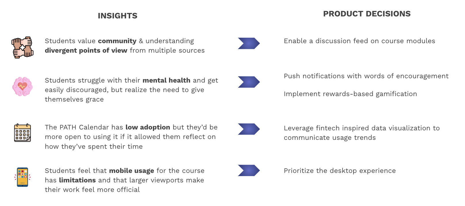
Using Miro to affinity map the qualitative data, I created a series of “I statements” to summarize & generate insights, leading to product decisions.

IDEATION
How Might This Look?
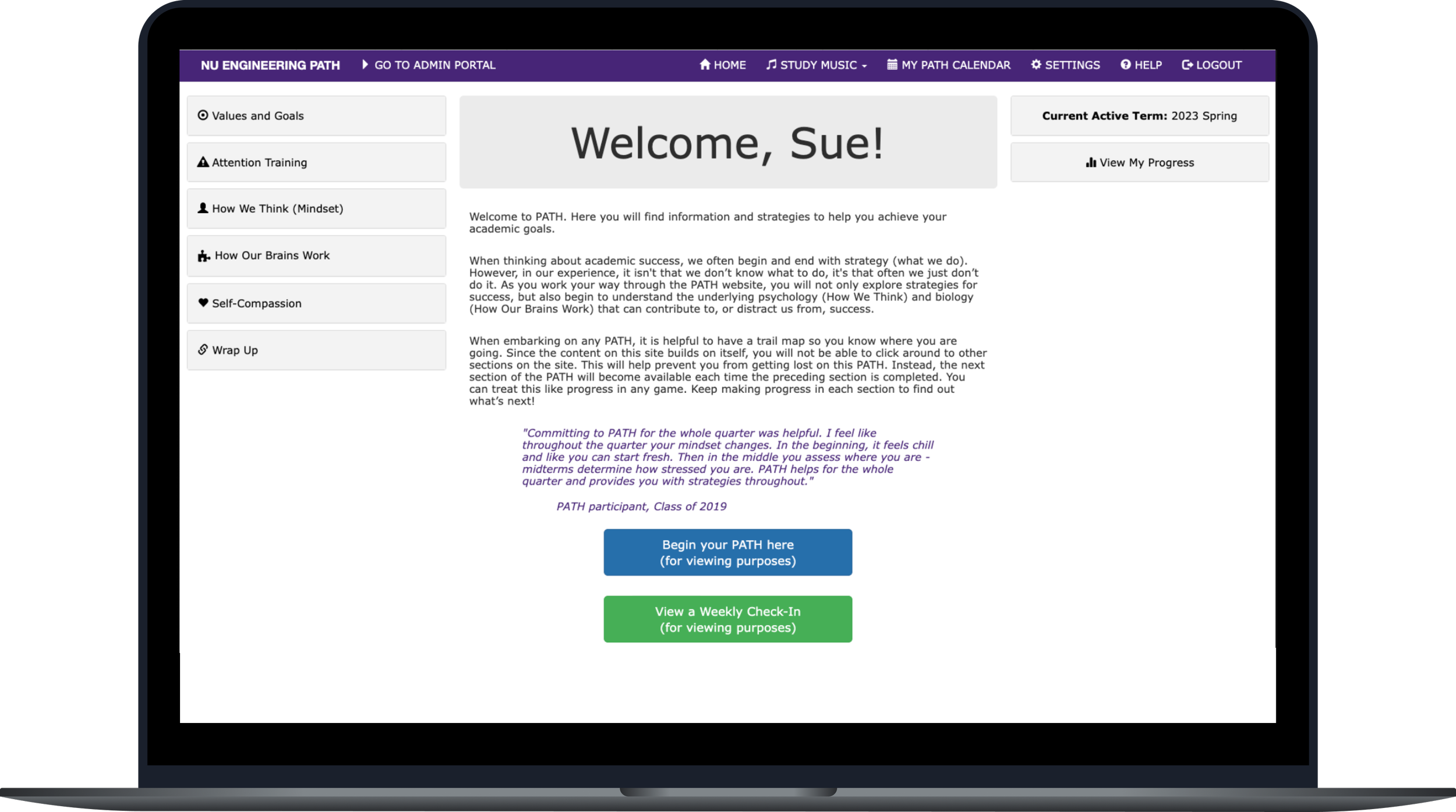
Armed with insights, I turned to Figma to wireframe key pages to create initial design direction and further cross-disciplinary conversations.


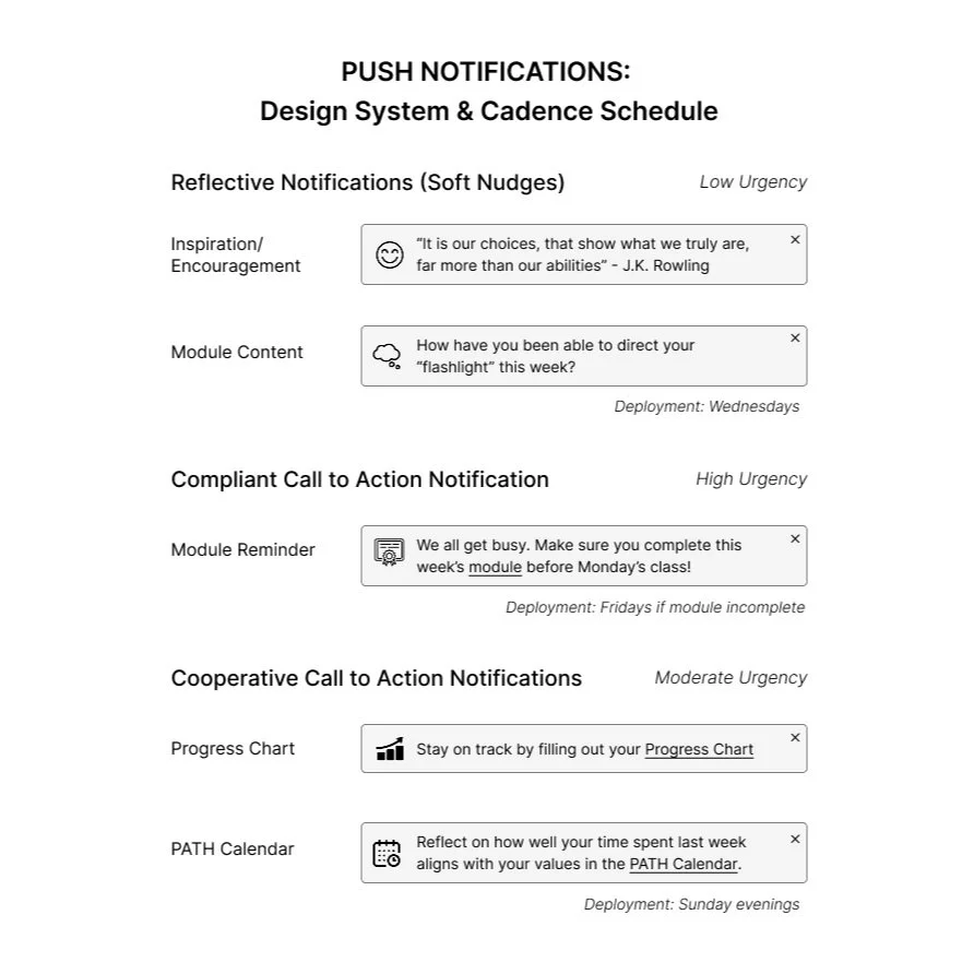
Ping Me Maybe?
Why push notifications?
The organization needed to drive students back into the platform for engagement
Students needed encouragement for academic resilience
But to socialize the feature with our clients and spur conversation, I created a framework to govern potential notification types, their level of urgency, and suggested deployment cadence.
How Rewarding!
I advocated for rewards-based badges to recognize and reward user achievements.
Well-designed badges enhance engagement and encourage ongoing user interaction, all of which we wanted for our students.
I created the types of badges students can earn (influenced by stakeholder & user needs), wrote the needed content/UX writing, and lobbied for a click-to-flip interaction style.
After I was about 75% finished with these wireframes, I shared the concept with our designers to give them ownership as well. We co-created additional badge types, and they had great ideas on scalable illustration assets that could work for Northwestern or any other school.

DESIGN PARTNERSHIP
Pass The Baton
As I handed over the keys and fully onboarded our designers, it was important to ensure user empathy stayed at the core of our work. I stayed involved—advising, providing feedback, and supporting without stepping on execution. We synced consistently to stay aligned, explore new ideas, and navigate design decisions together.
I typically use the following collaboration principles to ensure a strong, working relationship with designers, leading to faster decisions, smoother workflows, and more user-centered, effective design outcomes:
1. Translate Insights into Design Opportunities
What it means: Don’t just deliver findings—connect them to design implications (e.g., “Users need X → consider trying Y in the UI”).
Why it matters: Designers thrive on clarity and direction. Turn research into springboards, not dead ends.
2. Embed Myself in the Design Rhythm
What it means: Be present in critiques and working sessions. Align research cadence with design sprints or reviews if possible.
Why it matters: It builds trust and makes insights feel timely, not tacked on.
3. Make the Invisible Visible
What it means: Advocate for edge cases, emotions, and unspoken user needs that designers might not see.
Why it matters: Designers often focus on flows and visuals—my job is to surface the why behind user behaviors.
4. Practice Humility
What it means: UX research and design each bring something unique. Stay open, challenge respectfully, and be ready to have assumptions disproven.
Why it matters: The best design partnerships are rooted in curiosity, not ego.


THE IMPACT
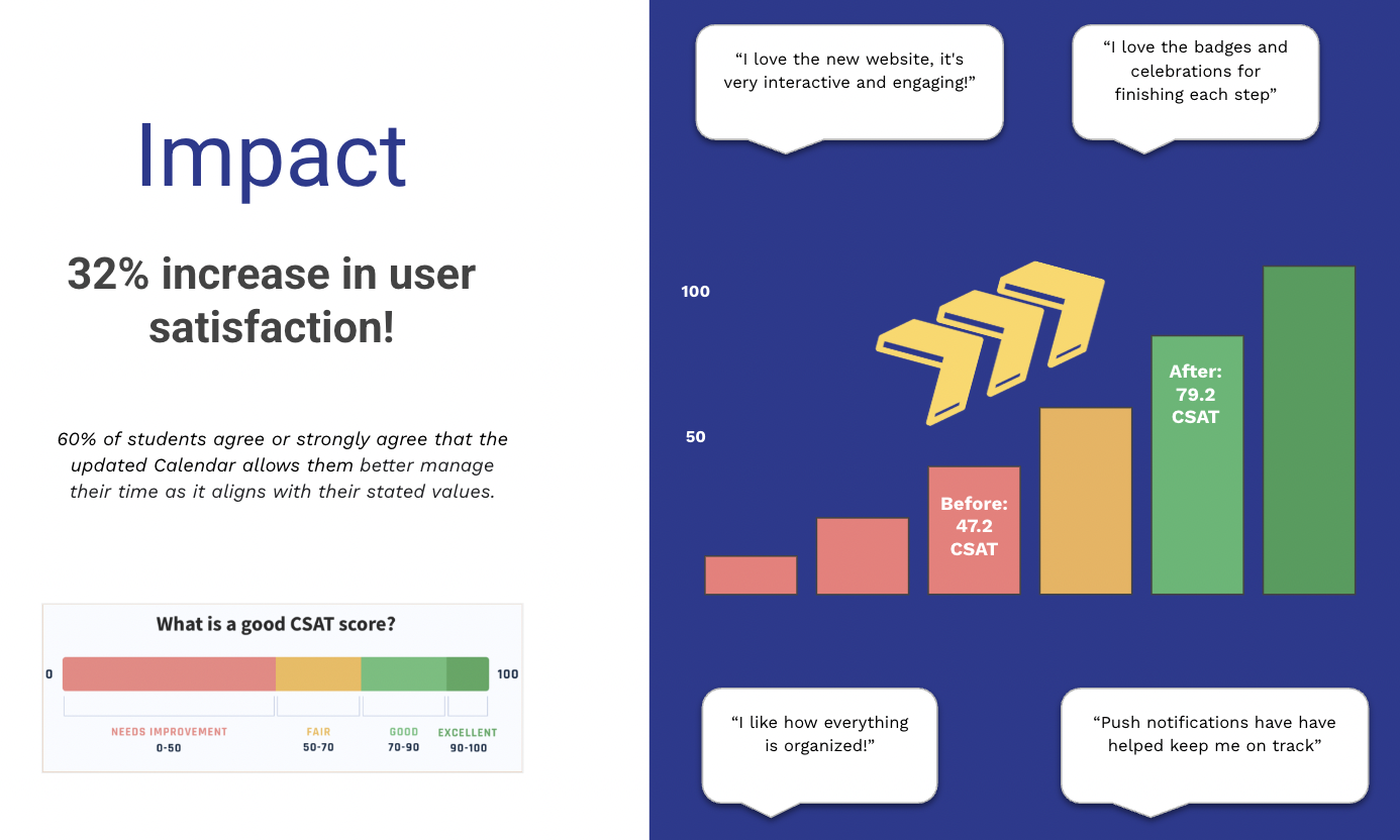
The transformation of Northwestern PATH represents not just a redesign of an LMS but a reimagining of how students engage with their learning journey.
Our gameful approach has not only fostered personalization and retention but also created a more distinctive sense of place and space for the PATH brand, ensuring that students remain engaged and motivated throughout their learning journey.