Designing for the Humans Behind the Headsets


Southwest Airlines is known for great customer service—but with growing digital demands, their internal tools need to evolve too.
To enhance the agent chat experience within their C360 platform, I collaborated with their team to improve the system's intuitiveness, efficiency, and support for the fast-paced needs of their agents.
We worked together to simplify complex workflows, while bringing new innovation, and thoughtful design to a tool to help agents deliver quicker, friendly, reliable service.
Client
Southwest Airlines
Year
2023
Result
New AI-integrated workflow and redesign decreased average handle time (AHT) between chat agents and customers by 10%
Team Structure & My Responsibilities
Senior Manager of Technology
Senior Product Owner
Product Owner
UX/UI Designer
Engineer
Strategy Consultant
UX Researcher (Me!)
-

Discovery & Ideation (2 weeks)
Ethnographic Research | Stakeholder Workshops | Rapid Prototyping
-

Evaluative Research (1 Week)
Moderated Usability Testing | Unmoderated Usability Testing
-

Insights & Direction (1 Week)
Workflow Insights | Final Recommendations
DISCOVERY & IDEATION
Let’s Get Familiar
After accessing the demo environments, I met with team members to establish a baseline understanding of Customer 360’s interface and workflow.
When a customer interacts with the site or app’s chatbot and is transferred to an agent, a case is created and linked to the chat transcript.
Agents then work, classify, and close the case, adding comments as needed.
Check-ins, flight changes/cancellations, applying refunds/credits, and lost/stolen/damaged baggage are the main reasons customers contact the help desks.


Key Learnings
Agent Workflow & Limitations
-
Chat agents typically work on the email or phone help desks as well. It’s likely they transfer expectations from one channel to another.
-
No two customer interactions are alike and there are multiple ways to access detailed customer information.
-
They typically service two customers at a time and use 3rd party systems (ARD and CIRRUS) to find more detailed flight and transaction information.
-
Chat agents complain about limited workspace, the chat window being too large, lack of saved ‘quick text’ features to reduce time typing like the system’s email desk has, and the inability to view chats and perform actions simultaneously due to nested tabs.
Personalization
-
Email agents underuse the quick text feature, relying instead on sticky notes or Excel to access personalized responses.
-
Balancing the standardized quick text with the warm "Southwest Voice" presents a challenge.
What’s Our Key Problem?

I decided to run a two day collaborative workshop with our project team and agent representatives to:
Provide a structured approach to complex, ambiguous problems
Better identify & understand system inefficiencies & prioritize agent needs
Build trust & positive relationships with new teammates and end users
-
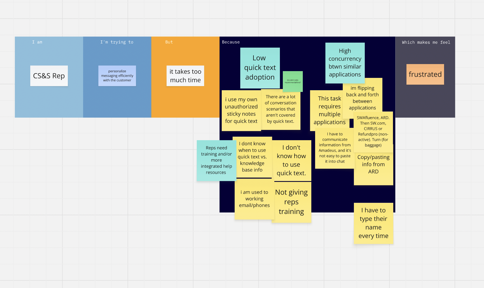
Day 1: Empathy Mapping
I guided participants through listing their key pain points using the "I'm trying to/But/Because/Which makes me feel" framework across various use cases. I then framed those feedback trends and used them as inputs for our next step.
-

Day 2: Solution Prioritization
Transitioning from problem identification, we used a Pain/Importance Matrix. Teams dot-voted on pain points for validation, then conducted rapid ideation sessions (1 minute per pain point) to generate potential solutions. Final dot voting prioritized solutions based on pain level and user importance.
Strategic Outcomes & Recommendations
High-Priority Solutions (Top Right Quadrant):
Guided workflow processes with progressive interactions or screen flows
Streamlined categorization with most frequent options prioritized first
Pre-call context awareness and PNR identification before customer interaction
Faster loading speeds to decrease average handle time
Customizable agent workspace if technically feasible, with continued personalization and efficiency efforts
Actionable Design Recommendations:
Enable fixed chat window visibility throughout interactions to help reduce context switching
Implement customer service categorization at workflow start (not end) on the top left corner for higher completion rates
Add copy-to-clipboard functionality for PNR management
Reduce the use of custom Salesforce Lightning components to improve system performance
Leverage AI for immediate customer context and easy-to-access personalized response suggestions
Let’s Ideate
I partnered with our UX/UI Designer to run a design studio, each of us sketching multiple solutions and exploring trade-offs before he ultimately delivered on the below:
Before
After

We then aligned on areas of the design that carry the highest uncertainty to inform what should be evaluated in testing.
EVALUATIVE RESEARCH
Research Approach
Because Southwest was an engineering-led organization with low UX maturity, it would be important for me to not just execute user research but to shift organizational mindset around the value of user-centered design. They needed to see the risk of shipping solutions blind.
Methodology
I conducted a two-phase usability study using a within-subjects design. To gather detailed feedback and increase visibility, I moderated live sessions with leadership observers, while I deployed unmoderated tests to ensure unbiased results and statistical reliability.
Group A: Moderated Testing
5 representative business users
Microsoft Teams sessions with screen sharing
Think-aloud protocol
Direct observation by our team and senior stakeholders
Group B: Unmoderated Testing
20+ chat agents
Self-directed testing via Maze platform
Completed during the work week for statistical relevance
Quantitative metrics tracking
Research Objectives
Can users intuitively recognize key icons that support intended tasks?
Can users complete key tasks successfully?
How well does the visual hierarchy and 3-column layout support sequential workflow?
How well does the interface instill confidence in new, undertrained chat agents?
Key Metrics Tracked
Quantitative:
Task success rates (Fail/Partial/Success)
Misclick rates
Bounce/abandonment rates
Completion rates
Qualitative:
User sentiment and reactions
Pain points and confusion areas
Feature preferences
Open-ended feedback
Testing Scenarios/Tasks:
Participants completed realistic workflow tasks:
Send an email to a customer while working a chat
Categorize a case for a missed connecting flight due to delay
Auto-fill customer name into chat for personalization
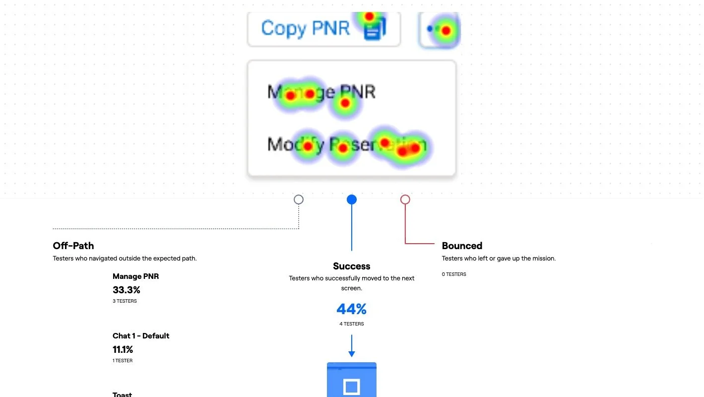
Copy PNR to clipboard and navigate to ARD system
Key Findings
What Worked Well
Email Functionality (Scenario 1)
Moderated success rate: 100% (all participants scored 3/3)
Unmoderated success rate: 59%
User sentiment: "That's a lot easier than having to open up another workspace" / "I love that!" / "That's handy dandy!"
Insight: The in-line email button triggering the new pop-up docked component eliminated the need for additional tabs or windows
Copy PNR Feature (Scenario 4A)
Moderated success rate: 100%
Unmoderated success rate: 75% clicked correct CTA initially
User sentiment: "Love it!" / "There are other reasons to copy the PNR too"
Insight: Unanimously well-received; streamlined a common workflow
Visual Improvements
Positive feedback on breathability and reduced clutter
Appreciation for chat component placement ("I liked that Chat was on the top right!")
More organized overall structure
Areas for Improvement
Sizing & Readability Issues
Chat workspace felt too small to some participants
Font size concerns, especially for older users
Categorization Confusion (Scenario 2)
Moderated completion rate: 1.5/3 average (lowest performing task)
Unmoderated misclick rate: 57.9%
Key issues:
Users split evenly between starting with Category vs. Subcategory
Strong preference for subcategory-first workflow with auto-populated category
Difficult to identify correct option for specific scenarios like missed connections
Terminology didn't match user expectations ("I was looking for [the term] flight delay")
Auto-fill Name Feature (Scenario 3)
Moderated completion rate: 2/3 average (partial success)
Unmoderated misclick rate: 81% (highest)
Key issues:
Low discoverability on first attempt
Users defaulted to trying to manually select and copy text from chat history or customer info
Will take required learning time, though moderated testing showed enthusiasm once discovered
Navigation to ARD (Scenario 4B)
Unmoderated success rate: 44% (lowest completing task)
Unmoderated bounce rate: 60% (highest abandonment)
Unmoderated misclick rate: 61%
Key issues:
Confusion between "Modify Reservation" and "Manage PNR" terminology
Some users backed out of screen to access ARD manually
This feature didn’t appear to add significant value
Context Switching Challenges
73.6% misclick rate when sending email
Heavy concentration of clicks on Customer Search and Case tabs at the top in global navigation
Users expect to context-switch through global navigation rather than inline features


INSIGHTS & DIRECTION
User Insights: Key Workflows
Most Common Case Actions
Search all flights by PNR
Search customer RTFs (Rapid Rewards)
Issue SLVs (Southwest LUV Vouchers)
Change customer for case
Add related customers
Add comments
Einstein AI Reception
Moderate reception with concerns about personalization
Facial expressions and non-verbal feedback hint at a level distrust of AI
Apprehension exists but a careful rollout strategy could improve buy-in
Recommendations
1. Improve Information Density and Readability
Increase font size for better readability, especially for older users
Widen the chat component if technically feasible
Reduce visual clutter while maintaining necessary information
Optimize layout for large monitor usage (89% of users)
3. Enhance Context Switching
Add global navigation option for switching between email and chat
Provide multiple pathways to accomplish the same task to support flexibility in user workflows
Keep the proposed inline method but don't make it the only option
5. Optimize Auto-fill Name Feature
Improve discoverability through visual cues or onboarding
Consider tooltip or subtle animation on first use
Despite initial confusion, strong positive sentiment suggests high adoption potential once learned
7. Further Explore Timeline Use Cases
Conduct follow-up research on timeline functionality
High usage frequency (85%) indicates critical importance
Understand specific tasks it supports to optimize placement and features
9. Address Systemic Tool Issues
Improve speed of ancillary systems that slow down workflow
Enable multiple PNR access simultaneously (like ARD)
Fix quick text functionality for smoother message sending
Provide easier access to standard verbiage templates
Most Common Customer/PNR Actions
Add KTN (Known Traveler Number)
Check-in
Day of travel changes and modifications
Check fare differences
Early Bird check-in inquiries
TSA PreCheck verification
2. Redesign Categorization Workflow
Prioritize subcategory selection with automatic category backfill to reduces cognitive load and align with user mental models
Conduct card sorting exercise to improve terminology and labeling
Make categorization more descriptive for specific scenarios (e.g., missed connections)
4. Improve Multi-Chat Management
Implement nested tab functionality for multiple simultaneous chats
Enable notifications to toggle between conversations
Address agent concerns about disorientation and stress
Consider workflow implications of handling multiple customers
6. Clarify ARD Navigation
Revise UX copy to distinguish "Modify Reservation" from "Manage PNR"
Validate if direct ARD navigation adds sufficient value
May be "nice-to-have" rather than essential feature
8. Enhance Visual Distinction
Implement color coding for case types (e.g., black for chat, blue for general sales) to improves quick visual scanning and reduce cognitive load
10. Create Einstein AI Rollout Strategy
Address awareness gap about Salesforce Einstein capabilities
Develop value proposition messaging to reduce apprehension
Provide training and examples of AI benefits for AHT and ease of use
Position AI as a way to accelerate, augment, and accommodate - not replace their human ingenuity
When you design for the humans using your product, everyone wins. This research demonstrates the transformative power of user-centered design: rigorous testing revealed exactly what agents need to work faster, smarter, and with less stress. The path forward is clear and continuous - implement new insights, iterate with users, and empower frontline teams to deliver the exceptional service customers expect.
Great UX isn't just about interfaces; it's about giving people the tools to do their best work.